

mattathias
-
Posts
25 -
Joined
-
Last visited
Content Type
Profiles
Forums
Store
Events
Posts posted by mattathias
-
-
3 hours ago, Kearnsy said:

Love the hoodoo gurus. A great Sydney band. That car is a holden monaro too, good Aussie touch!
-
 2
2
-
-
16 hours ago, xBrownstonex said:
I'm thinking that is fanmade aswell
yes, seems like it is
BC Rich Mockingbird guitar. Fucking love it, that is amazing
-
1
-
-
6 hours ago, estrangedtwat said:
Seeing a lot of overlap on my favorites as well as some real surprises.
Imola 2 AND Adelaide Skull Bogan? Those are universally reviled...Mattahias you're a wild man!
Yep, that's the whole point. I'm not really skewed by like born in the USA or other peoples thoughts - as much as I respect them. I've been to Portugal and that poster nails it, but it still doesn't really take me anywhere.
-
Just now, amaninjapan said:
I am obsessed with finding out what the fuck the inspiration was for that. Because that one was just fucking WEIRD.
See a movie called Bad Boy Bubby. It could only ever be made in Adelaide. They're a strange bunch. They speak funny too not like the rest of us. Very posh.
-
actually yeah the Adelaide Bogan/redhead is definitely in my favs. Just captured the quirkiness of Adelaide beautifully.
-
1 minute ago, amaninjapan said:
One day when I get lazy, I'm going to fuck around with the colors on Perth Bunyip and come up with something that appeals to me more. I love everything about it except the color.
Yokohama is definitely underrated. I think it's the most underrated Japanese litho as much as Melbourne Tiger is the most underrated Australian litho. One night in Hameenlinna is really close but I feel like there should have been even just ONE more subtle element added in. Not sure what but it just seems SLIGHTLY too simple. It's definitely a nice design though.
Another one I want to mention - Copenhagen. I was really disappointed that they went with something so obvious as the mermaid but it is really one of the great European designs. The lighting effect is really beautiful.
Bahahahahaha we've had this conversation, but I persist IT'S A TASMANIAN TIGER!!! It's not the Scottish Buckingham Palace, or the LA Chrysler Building. Sure the Tassie Tiger may have existed on the mainland, but the general conceit was a Yank that knew stuff all about Melbourne Googling a few poster ideas. That would've been an awesome poster if they played Hobart. Anyhow rant over!
-
6 minutes ago, estrangedtwat said:
I posted my Top Ten (so far) over on gnfnr a little while ago.
Now that we're on the verge of another leg, I'd love to hear personal top tens (so far) from my fellow Litho maniacs!
Especially you maninjapan, since you probably have more of these in person (or at least will when all is said and done) than the rest of us!
Not in any real particular order. Inface the Kiwi and Aussie ones should be a lot higher. Here's my favs. I have at least 3 of them!
10. Wellington NZ. The second I saw it I bought it. Reminds me of a legendary NZ movie called Once Were Warriors about gangs, family and Maori culture.
9. Italian Cannibal Holocaust. Again it's local and esoteric with a reference to a crazy, bizarre horror movie. Would could be better?
8. Yokohama. In the words of amaninjapan it's a real sleeper. It's been on the wall now for a while and just grows on you. The subtle details are fantastic.
7. one night Haamellina (?) looks scary as hell and is uniquely Finnish. You may also be able to tell by the frenetc sketching that the Finns consume the most coffee on earth.
6. Melbourne Ned Kelly. Because it's local and the guy nailed it. Ned Kelly is Australia's Billy the Kid Outlaw hero. I don't care that the rest of the world doesn't get it. It's not the point
5. Dali clocks. Buhler managed to capture so many of Dali's techniques like painting on the rough side of the canvas here. He shows a real insight and WTF is there not to like about Dali? I'm a Picasso guy myself but hey.
4. New Orleans poster. I swear that Skull is Bo Diddley. Just Sayin'. And Big Bad Bo was the man
3. Kobe Samurai warrior. Just the whole shebang about this poster. Very small gig, it was snowing just a perfect storm - no pun intended.
2. Perth Bunyip. Bloody Aussie as but it's beyond the kitsch, it's just a fantastic design.
1. SF Dirty Harry. I shat my pants the first time I saw it, it's just brilliant.-
1
-
-
3 hours ago, amaninjapan said:
It's not pretty but it's clearly a reference to old Italian horror films. It's a specific genre called "Giallo" - https://en.wikipedia.org/wiki/Giallo
I spent some of my youth living in Italy so it definitely has that old VHS low-budget Italian horror movie vibe.
In fact, I just did a google search to verify my suspicion and sure enough, it's definitely a reference to the Italian "Cannibal Holocaust" cover:
EDIT: Oops, wrong link
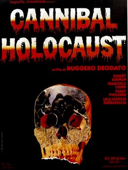
WTF I had no idea there were two Imola posters! That horror one is mad. It's absolutely brilliant. See local designers (i'm assuming here) always tap into something real. This is like the Ned Kelly poster for Melbourne. If you know the reference it's awesome and it truly reflects the place.
-
44 minutes ago, estrangedtwat said:
I posted my own personal top ten over on gnfnr. But I have to amend it to add Paris, cause that one is gorgeous as hell.
Cinci is still number one though!
yeah I saw that, that was pretty cool.
-
Hey gang some useless information for you. From gnrposters.rocks, here's the top 10/shittest posters as voted by random strangers on the internet with nothing better to do. Time for some national pride. Some could argue the sample size is not statistically significant. But if there are any statisticians here, please shoot me. I did not come here to discuss standard deviation and ANOVA with mathletes. Oh and you can always skew the sample by adding more votes.
I'm a bit disappointed, but oh well Adelaide's a shit hole anyway. Anyways here goes.
Top 10 posters
#10 Hannover DE
#9 Foxboro MA USA
#8 Wellington Maori Warrior NZ
#7 Bangkok TH
#6 Yokohama JP
#5 Kobe JP
#4 Stockholm SE
#3 Cincinnati OH USA
#2 New Jersey Devil NJ USA
#1 tie breaker Modena IT/Madrid ESShittest 5
#1 Adelaide AU
#2 Arlignton TX USA
#3 Singapore SG
#4 Auckland NZ
#5 Coachella CA USA -
15 minutes ago, xBrownstonex said:
No, thats probably just a promotional poster
I hope you're right but I reckon that's the poster. The bloke in his Instragram says it's limited edition. It's a decent design but it's scary compliant and inoffensive.
-
Oy vey our Hebrew friends have been very efficient. The Israeli poster is out before the Dutch one?
-
the one I TRULY want is the Israeli one. If any members of the tribe out there could assist I'd be eternally grateful. I've been thinking of hitting up my local synagogue for help!!
-
2 minutes ago, DieselDaisy said:
The Little Mermaid?
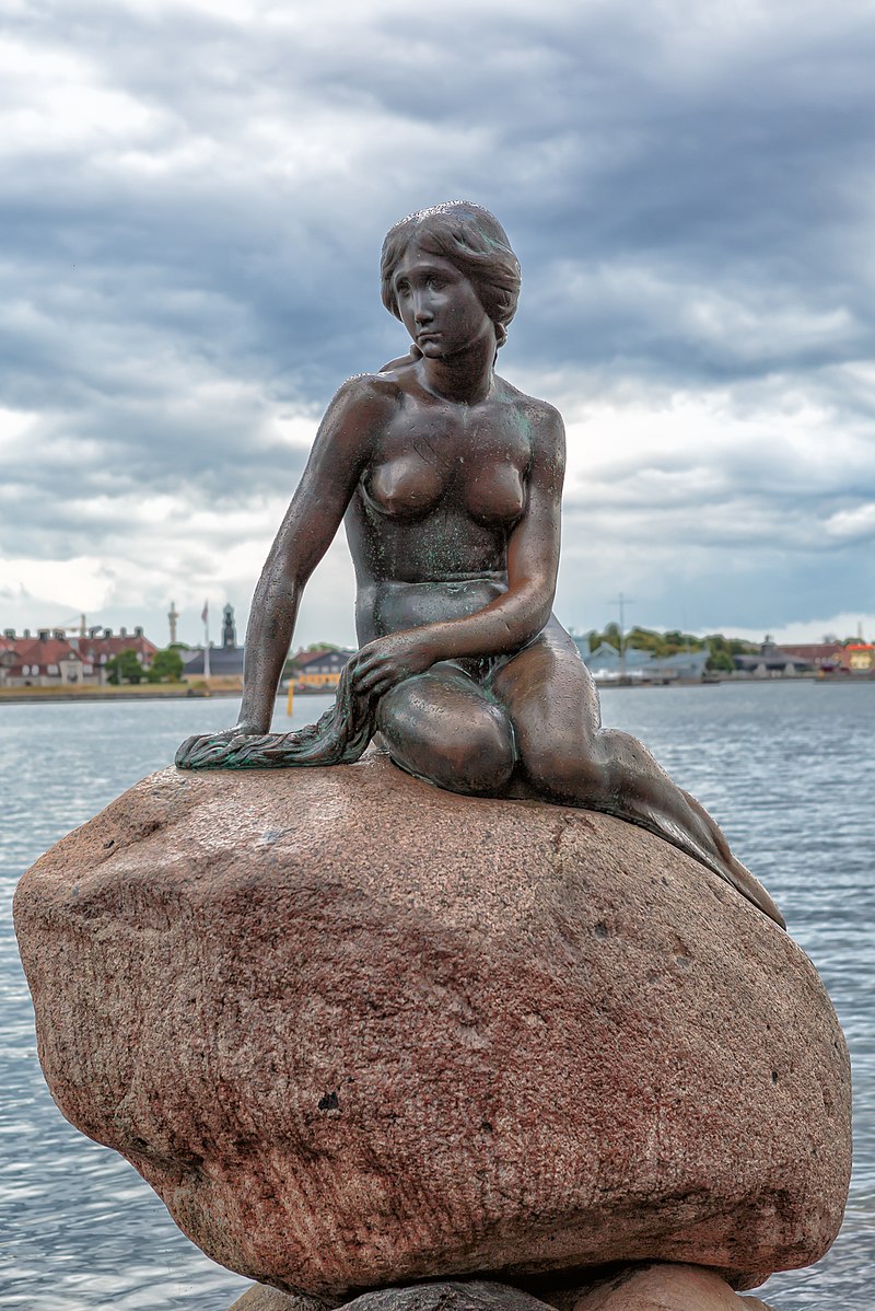
Sorry Mods about the boobies!
No one should ever have to apologise for tits. It's in the Australian constitution.
-
24 minutes ago, estrangedtwat said:
I'll be brutally honest mattathias: I didn't spend much time browsing the site because the layout is overly complicated to me.
Just trying to offer some constructive criticism cause I know you put a lot of time into it...have you thought about a faster-loading, simpler "low-fi" alternative version?
Thanks for the feedback, others have given similar feedback and I might look for a better Wordpress template. I chose this one because it's art first and responsive to mobile devices. What do you find complicated about the layout? Feel free to PM if you'd prefer.
-
Http://Gnrposters.Rocks/ is mine but it's mostly aggregating what you lot come up with! A few people here have reached out and given awesome insights which rules. But there are still so many answers and insights I'm after. Particularly who designed the Melbourne and Adelaide posters amongst others!
-
1 hour ago, estrangedtwat said:
Hey let me know if you've found better/clearer pics of the ones I've got in my thread here. I'm still maintaining it. I want it to remain a one stop source for all the biggest, cleanest images with no commentaries or anything. I know I'm missing some of those early ones...maybe Troubadour, Vegas, Coachella?
Will do mate. A few peeps have reached out and said they'll take photos of their posters and share them, but none yet. If you see anything on the site you want just reach out!
-
hey peeps, I've updated http://gnrposters.rocks/ with these new Euro posters and whatever information I can find. Please rate your favourites and let me know of any F*ck ups, additional info you have or commentary. Thanks heaps!
-
2
-
-
6 hours ago, uzi your illusion said:
It will be interesting once more posters go on your site and rate the lithos to see which get the most stars.
I was surprised to see you rate San Francisco that high. I would have thought Cincinnati was hands down more sought after then that one. I have both and love them. Just never hear anybody talk about the San Fran litho.
Hey mate, you'll have to keep us honest then. From what I've seen Kobe is hands down the $$$ winner, then San Fran, then Kansas City. I've never seen a Cincinnati one for sale. That is the real reason I started the blog though: to get the stories and insight into these posters.
For example the Melbourne poster with Ned Kelly, he's Australia's outlaw like a Billy the Kid. Whoever did that poster really nailed it but if you're not Aussie you'd never know! -
6 hours ago, nzgnr said:
would be good if it was something like the castle being attacked by a dragon or something loch ness monster would be wicked but thats from scotland so won't work
Hey guys, who's Slane? Has he got an instagram I can follow or something so I can put his poster on my site?
Cheers,
Matt -
8 minutes ago, ZoSoRose said:
Missing at least the lighter Tokyo dragon poster and the Lima one was fake
Still awesome!
Hey mate, the Lima one is totally fake but I love the guy's passion! The lighter Tokyo poster is on the same page as the blue one. It's good feedback though, I should add a separate page for it. Thanks heaps!
-
1
-
-
Hey Full, yep def missing that. I can't find a decent photo of it. If you can find one, hook a brother up!
-
- Popular Post
- Popular Post
Hey guys,
I've been working on a blog for a little while. It's now live http://gnrposters.rocks/. I have about 50 posters shown there.
There's some basic info about the posters, some info on the artists and you can give a 'star rating' to your favourite posters. Thanks to all of you that answered questions and supplied the poster photos. You guys rock! If you do have any feedback or know have more info, please let me know.
Cheers,
Matt-
10
-
Hey guys, I've started putting together a little blog for these posters. It's still on my hard drive, but the intent is to be a permanent exhibition of these posters and provide as much detail around them as possible.
Problem is, I've only been able to identify 2 of the artists: Arian Buhler and Sara Ray (San Diego poster). Does anyone know any of the other artists?
Also If anyone's a real trainspotter like me and would like to lend a hand, let me know. I could use the help! Well actually a lot of the imagery was from here anyway. So thanks guys like Estranged Twat, just blows me away!
-
1
-

Tour Lithographs and show specific artwork
in GUNS N' ROSES - DISCUSSION & NEWS
Posted
Has anyone seen any number A/P or artists proof? I've been really curious about that. That's generally how studios handle this stuff. E.g. they generate a few artists proofs to check that the printing process is sound before starting the numbered editions. Generally studios are very reluctant to sell the A/Ps